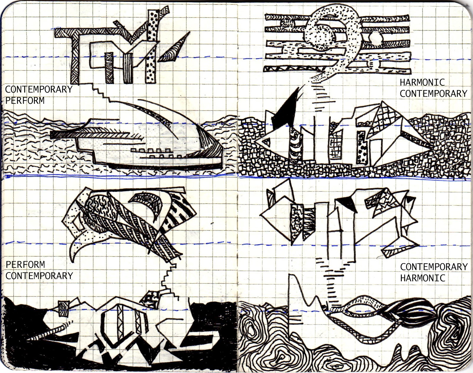
One Point Perspective

Environment:
Based on these images of the Kravice Waterfalls

My first cry engine sketches:


My second Cry Engine environment attempt:


Architectural Theory:
Creating order through colour
The
more stuff in the design, the busier the work of art, the worse it is. Order is the way in which
meaning emerges from material pattern in architecture. More is less. Less is more.
The inability to recognize a pattern of events is synonymous with being lost.
Having
said this, the eye is also a menace to clear sight. Sunlight
gives birth to all form allowing us to order our surroundings through sight. Colour is a
rational, disembodied, optical experience. People
are located in time and place through the recognition of pattern. The meaning
to be located is the outcome of understanding the pattern of one’s context. A
monochrome ground unifies the disparate parts of the architecture, but also
explicitly fictionalizes the space to allow for imaginative projection. Because order in architecture is the sum of patterns that
might be identified in buildings and landscapes,
it is not a closed list but one that grows with each new insight into what
order might mean. A purely formal
explication of colour allows its recuperation into an idealist program that
strips it of its dangerous qualities, and promotes the disinterested
contemplation, which is the foundation of an aesthetics of taste. A place we are in strikes us as being particularly significant. Precise and integrated colour-space relationship allows us
to form rationality in our experience of the world in opposition to the
subjective aspects of sense perception.
Color Codes: Modern Theories of Color in
Philosophy, Painting and Architecture, Literature, Music and Psychology, By Charles A. Riley
Art as Art: The Selected Writings of Ad
Reinhardt
(New York: Viking Press, 1975)
http://www.kendallhunt.com/samples/3269.pdf
Week 2:
Two Point Perspectives

2 Images of first person perspective as the elevator is in use
Dean's Elevator:


View from the Dean's elevator:

Student's elevator:


Week 3:
Reconstruction of plan to section:
DRAFT 1

REVISED DRAFT:
After completing the first draft, it became evident that the design did not respond to the "bridge"component of the architecture. Therefore I revised the first draft with a different plan to achieve a design that responded to the idea of a bridge more:


Week 4:
Student Marking

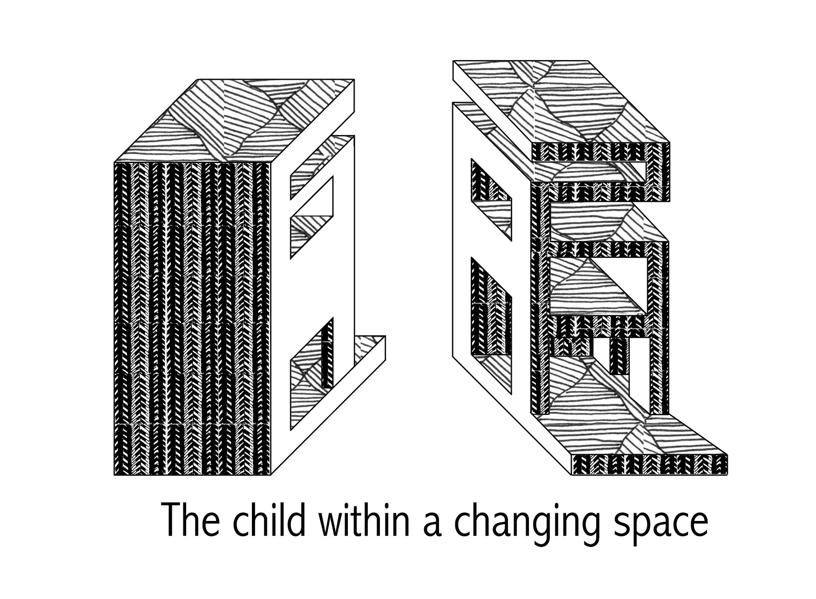
36 textures

Application of the textures to explore movement.
Image 1: Meeting spaces for students and staff are met with dynamic textures as to represent the innovative architectiural discussions that could take place in these spaces.

2. The school entrance: the gallery space with the library up ahead. This abstract bright pattern in the gallery space inspires and reiterates the dynamic notion of design in architecture. The monochromatic texture in the library implies that it is a space which holds things that have already been discovered, studied or designed.

3. A natural inspired pattern is used in the student break/ recreational area.

COMPLETE MODEL IN ENVIRONMENT
THE BRIDGE AND FOLLY
 Image 1: At night, when there is no light to illuminate the surroundings bright architecture, the university becomes a humble merger with the environment.

THE BRIDGE AND FOLLY
 Image 1: At night, when there is no light to illuminate the surroundings bright architecture, the university becomes a humble merger with the environment.
Image 2: The school is rested in the heart of the Kravice waterfalls. The absence of a city and bordering architecture allows students in this architecture school to be able to design fresh ideas, uninfluenced by architecture that has already been created around them.

Image 3: The folly meets the architecture in the middle of the waterfall upon rocks. This allows students to view both the landscape and folly concurrently without elements such as trees being in the way.

Image 4: The left entrance point to the university. Students have a clear gravel path which leads them to their destination.

Image 5: The studios are the first rooms that the students will see when they enter the bridge from this side. From the opposite entry of the university, the gallery will meet people at the entrance (the gallery is seen amongst the texture images.

LINKS:
Sketchup model can be found here:
https://www.dropbox.com/s/lpf6sfata3jppuo/Final%20Sketchup%204%20EXP3.skp
Cryengine file can be found here:
https://www.dropbox.com/sh/tjpwiqhtr3rjo2n/4_dFphdEbZ
Folly file can be found here:
https://www.dropbox.com/s/vjindveh7svxoya/AutoSave_FOLLY.skp
Elevators can be found here:
https://www.dropbox.com/sh/kwcvp4ofaonws38/rKdTcPDNKj


